understanding what word vectors are, and what they mean in modern natural language processing
Experiments
NLP
Machine Learning
Published
May 22, 2023
Word vectors are a mainstay of NLP, and are used in a variety of tasks, from sentiment analysis to machine translation. In this experiment, we will explore the very basics of word vectors, and how they can be used to represent words in a way that captures their meaning. Word vector models represent words as vectors in a high-dimensional space, where the distance between vectors captures the similarity and relationships between words within a given context of a corpus.
For the purposes of simplicity, we will use the gensim library and a ready made word vector model. The model we will use is the glove-wiki-gigaword-50 model, which is a 50-dimensional word vector model trained on the Wikipedia corpus.
Let’s start by loading the model.
Show the code
import osimport sysimport contextlibimport gensim.downloader as api# Define a context manager to suppress stdout and stderr@contextlib.contextmanagerdef suppress_stdout_stderr():"""A context manager that redirects stdout and stderr to devnull"""withopen(os.devnull, "w") as fnull: old_stdout = sys.stdout old_stderr = sys.stderr sys.stdout = fnull sys.stderr = fnulltry:yieldfinally: sys.stdout = old_stdout sys.stderr = old_stderr# Use the context manager to suppress output from the model downloadwith suppress_stdout_stderr(): model = api.load("glove-wiki-gigaword-50")print(model)
KeyedVectors<vector_size=50, 400000 keys>
Using word vectors for question answering
We will use this model to explore the relationships between words. Let us start with a simple problem - “Brasil is to Portugal, what X is to Spain”. We will use word vectors to estimate possible candidates to X.
Show the code
# Calculate the "br - pt + es" vector and find the closest wordresult = model.most_similar(positive=["brazil", "spain"], negative=["portugal"], topn=1)print(result)result_word = result[0][0]# Print the shape of the result vectordimensions = model[result[0][0]].shape[0]print("Number of vector dimensions: ", dimensions)
[('mexico', 0.8388405442237854)]
Number of vector dimensions:  50
Great! We now have a candidate word for X and a probability score, also notice how the resulting word vector returned by the model has 50 dimensions.
These numbers encode a lot of meaning regarding the word ‘mexico’, and in general, the more dimensions present in a given word vector model the more semantic information can be represented by the model!
Visualising word vectors
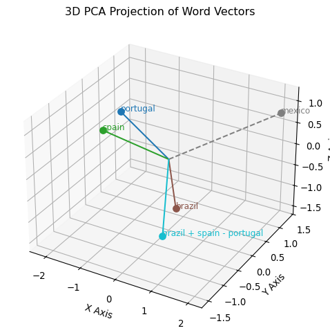
Now let us attempt to visualise the relationships between these vector representations - we will perform a comparison between an actual vector operation, and the estimate returned by gensim using the most_similar operation. We first need to get vector representations for all the words (“portugal”, “brazil”, “spain” and “mexico”) so we can plot their proximity.
Show the code
import numpy as np# Calculate the "brazil + spain - portugal" vectortrue_vector = model["brazil"] + model["spain"] - model["portugal"]words = ["portugal", "spain", "brazil", result_word]# Get vectors for each wordvectors = np.array([model[w] for w in words])vectors = np.vstack( [vectors, true_vector]) # Add the true vector to the list of vectorswords += ["brazil + spain - portugal"] # Add the label for the true vector
Now, how do we visualize 50 dimensions? We’ll need to reduce the dimensionality of our vector space to something manageable!
PCA or t-SNE?
In this case, we will use Principal Component Analysis (PCA), a statistical procedure that utilizes orthogonal transformation to convert a set of observations of possibly correlated variables into a set of values of linearly uncorrelated variables called principal components. A better approach would be using t-SNE, but given we have a tiny number of samples, it makes little or no difference.
Show the code
import matplotlib.pyplot as pltfrom mpl_toolkits.mplot3d import Axes3D # enables 3D plottingfrom sklearn.decomposition import PCA# Perform PCA to reduce to 3 dimensionspca = PCA(n_components=3)reduced_vectors = pca.fit_transform(vectors)# Generate colors using matplotlib's tab10 colormapcolors = plt.cm.tab10(np.linspace(0, 1, len(words)))# Create a 3D figurefig = plt.figure(figsize=(8, 6))ax = fig.add_subplot(111, projection="3d")# Plot scatter points with text labelsfor i, word inenumerate(words):# Scatter each point ax.scatter( reduced_vectors[i, 0], reduced_vectors[i, 1], reduced_vectors[i, 2], color=colors[i], s=50, )# Annotate the point with its corresponding word ax.text( reduced_vectors[i, 0], reduced_vectors[i, 1], reduced_vectors[i, 2], word, fontsize=9, color=colors[i], )# Optionally add lines from the origin to each pointfor i, word inenumerate(words): linestyle ="dashed"if word.lower() =="mexico"else"solid" ax.plot( [0, reduced_vectors[i, 0]], [0, reduced_vectors[i, 1]], [0, reduced_vectors[i, 2]], color=colors[i], linestyle=linestyle, )# Set axis labels and titleax.set_xlabel("X Axis")ax.set_ylabel("Y Axis")ax.set_zlabel("Z Axis")ax.set_title("3D PCA Projection of Word Vectors")plt.show()
Notice how the “true” vector (the ‘brazil + spain - portugal’ edge) doesn’t seem to align much or be anywhere near “mexico” ? This can simply be explained by dimensionality reduction - the original number of dimensions is much higher than three, and our dimensionality reduction does not capture the complexity of the data. Take the above as a mere ilustration.
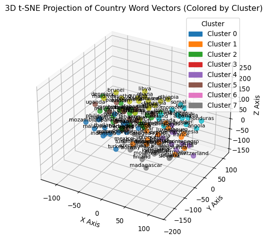
Now to offer a different visualisation, let us perform a 3D plot of a variety of countries. Additionally, we will also cluster countries into separate groups using KMeans. Can you discern how the algorithm decided to group different countries ?
Show the code
from sklearn.manifold import TSNEfrom sklearn.cluster import KMeansimport matplotlib.patches as mpatches# List of countriescountries = ["afghanistan","algeria","angola","argentina","australia","austria","azerbaijan","bahrain","bangladesh","barbados","belarus","belgium","bhutan","bolivia","botswana","brazil","brunei","bulgaria","canada","chile","china","colombia","cuba","cyprus","denmark","djibouti","ecuador","egypt","estonia","ethiopia","finland","france","gambia","germany","ghana","greece","guinea","guinea-bissau","guyana","honduras","hungary","iceland","india","indonesia","iran","iraq","ireland","israel","italy","jamaica","japan","kenya","kuwait","kyrgyzstan","lebanon","lesotho","libya","lithuania","luxembourg","madagascar","malawi","malaysia","maldives","mali","malta","mauritania","mauritius","mexico","micronesia","moldova","monaco","mongolia","montenegro","morocco","mozambique","namibia","netherlands","nicaragua","niger","nigeria","norway","oman","pakistan","panama","paraguay","peru","philippines","poland","portugal","qatar","romania","russia","rwanda","samoa","senegal","serbia","singapore","slovakia","slovenia","somalia","spain","sweden","switzerland","tanzania","thailand","tunisia","turkey","turkmenistan","uganda","ukraine","uruguay","venezuela","vietnam","yemen","zambia","zimbabwe",]# Assuming you have a pre-trained model that maps each country to a vectorvectors = np.array([model[country] for country in countries])# Perform t-SNE to reduce to 3 dimensionstsne = TSNE(n_components=3, random_state=42)reduced_vectors = tsne.fit_transform(vectors)# Cluster the reduced vectors into groups using KMeansnum_clusters =8kmeans = KMeans(n_clusters=num_clusters, random_state=42)clusters = kmeans.fit_predict(reduced_vectors)# Extract coordinatesxs = reduced_vectors[:, 0]ys = reduced_vectors[:, 1]zs = reduced_vectors[:, 2]# Create a 3D figurefig = plt.figure(figsize=(9, 6))ax = fig.add_subplot(111, projection="3d")# Plot scatter points, coloring by cluster using a discrete colormap (tab10)sc = ax.scatter(xs, ys, zs, c=clusters, cmap="tab10", s=50, alpha=0.8)# Create a legend with colored patches for each clusterhandles = []cmap = plt.cm.tab10for cluster inrange(num_clusters): color = cmap(cluster) patch = mpatches.Patch(color=color, label=f"Cluster {cluster}") handles.append(patch)ax.legend(handles=handles, title="Cluster")# Annotate each point with the country namefor i, country inenumerate(countries): ax.text(xs[i], ys[i], zs[i], country, fontsize=8, ha="center", va="bottom")# Set axis labels and titleax.set_xlabel("X Axis")ax.set_ylabel("Y Axis")ax.set_zlabel("Z Axis")ax.set_title("3D t-SNE Projection of Country Word Vectors (Colored by Cluster)")plt.show()
Answering further questions
Finally let us investigate a few more questions to see what the model returns.
Show the code
# Codfish is to Portugal as ? is to Spainresult = model.most_similar( positive=["spain", "codfish"], negative=["portugal"], topn=1)print(result)# Barcelona is to Spain as ? is to Portugalresult = model.most_similar( positive=["portugal", "barcelona"], negative=["spain"], topn=1)print(result)# Lisbon is to Portugal as ? is to Britainresult = model.most_similar( positive=["britain", "lisbon"], negative=["portugal"], topn=1)print(result)# Stalin is to Russia as ? is to Chinaresult = model.most_similar(positive=["china", "stalin"], negative=["russia"], topn=1)print(result)
Word vectors are a powerful tool in NLP, and can be used to capture the meaning of words in a high-dimensional space. They can be used to estimate relationships between words, and can be used in a variety of tasks, from sentiment analysis to machine translation. In this experiment, we used the gensim library and a pre-trained word vector model to estimate relationships between words, and explored the use of word vectors in a simple question answering task.