A Wine Quality Prediction Experiment with SKLearn Pipelines
pipelining in machine learning, for fun and profit
Experiments
Machine Learning
Published
February 18, 2024
In this experiment, let us use the Wine Quality Dataset from Kaggle to predict the quality of wine based on its features. We will investigate the dataset, use SKLearn pipelines to preprocess the data, and to evaluate the performance of different models towards finding a suitable regressor. This is a normal activity in any machine learning project.
Warning: Looks like you're using an outdated API Version, please consider updating (server 1.7.4.2 / client 1.6.17)
Dataset URL: https://www.kaggle.com/datasets/yasserh/wine-quality-dataset
License(s): CC0-1.0
Downloading wine-quality-dataset.zip to .data
  0%|                                               | 0.00/21.5k [00:00<?, ?B/s]
100%|██████████████████████████████████████| 21.5k/21.5k [00:00<00:00, 2.44MB/s]
Let us start by loading the data into a Pandas dataframe. Remember that a Dataframe is a 2-dimensional labeled data structure with columns of potentially different types. You can think of it like a spreadsheet or SQL table, or a dictionary of Series objects.
Show the code
# Read in '.data/WineQT.csv' as a pandas dataframeimport pandas as pdwine = pd.read_csv(".data/WineQT.csv")
Let us look at a few data examples.
Show the code
wine
fixed acidity
volatile acidity
citric acid
residual sugar
chlorides
free sulfur dioxide
total sulfur dioxide
density
pH
sulphates
alcohol
quality
Id
0
7.4
0.700
0.00
1.9
0.076
11.0
34.0
0.99780
3.51
0.56
9.4
5
0
1
7.8
0.880
0.00
2.6
0.098
25.0
67.0
0.99680
3.20
0.68
9.8
5
1
2
7.8
0.760
0.04
2.3
0.092
15.0
54.0
0.99700
3.26
0.65
9.8
5
2
3
11.2
0.280
0.56
1.9
0.075
17.0
60.0
0.99800
3.16
0.58
9.8
6
3
4
7.4
0.700
0.00
1.9
0.076
11.0
34.0
0.99780
3.51
0.56
9.4
5
4
...
...
...
...
...
...
...
...
...
...
...
...
...
...
1138
6.3
0.510
0.13
2.3
0.076
29.0
40.0
0.99574
3.42
0.75
11.0
6
1592
1139
6.8
0.620
0.08
1.9
0.068
28.0
38.0
0.99651
3.42
0.82
9.5
6
1593
1140
6.2
0.600
0.08
2.0
0.090
32.0
44.0
0.99490
3.45
0.58
10.5
5
1594
1141
5.9
0.550
0.10
2.2
0.062
39.0
51.0
0.99512
3.52
0.76
11.2
6
1595
1142
5.9
0.645
0.12
2.0
0.075
32.0
44.0
0.99547
3.57
0.71
10.2
5
1597
1143 rows × 13 columns
We can see the dataset is composed of 1143 samples, with 13 columns in total. Let us check the various datatypes in the dataset, and ensure there are no missing values.
And let’s visually inspect the distribution of the data.
Show the code
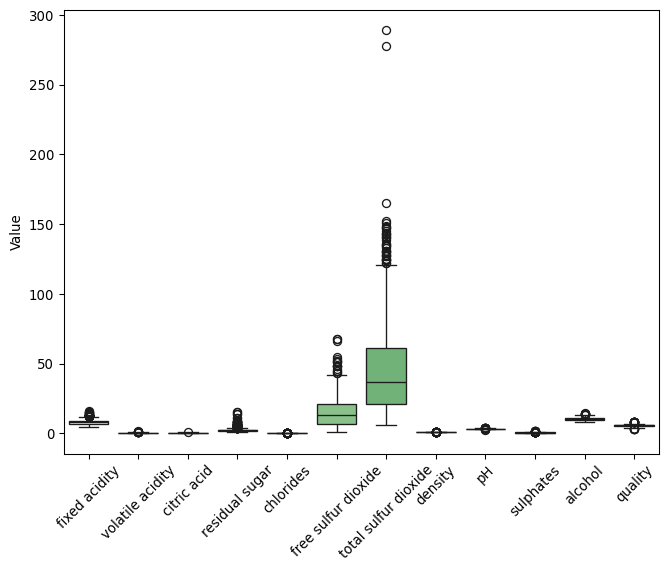
import seaborn as snsimport matplotlib.pyplot as pltplt.figure(figsize=(8, 6))sns.boxplot(data=wine, palette="Greens") # This applies the green palette directlyplt.xticks(rotation=45) # Rotate x-tick labels for better readabilityplt.ylabel("Value")plt.show()
Notice above how ‘total sulfur dioxide’ and ‘free sulfur dioxide’ have a very different scale compared to the other features.
About Scaling Features
An important step in preprocessing the data is to scale the features. This is because the features are in different scales, and this can affect the performance of the model. We will use a MinMaxScaler() to scale the features when defining the pipeline for our processing, as MinMaxScaler() scales the data to a fixed range [0, 1] and helps in preserving the shape of the original distribution (while being more sensitive to outliers).
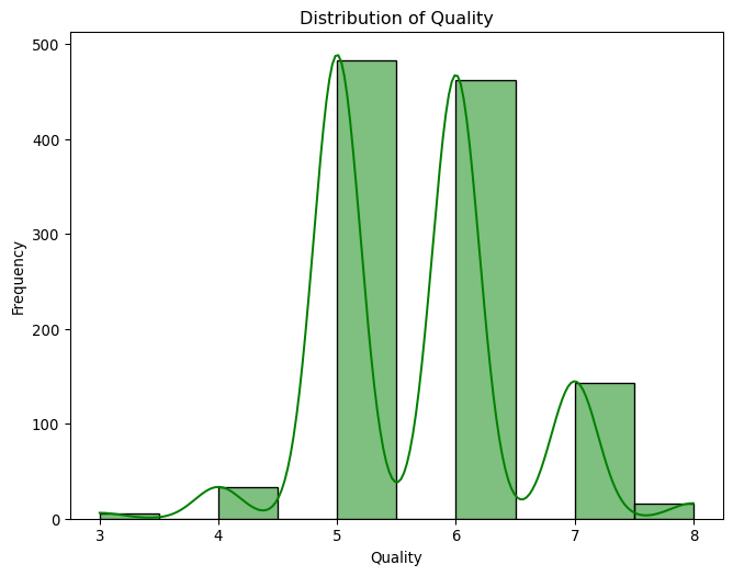
Our target variable is the ‘quality’ column, let us look at its distribution more carefully.
Show the code
# Show the distribution of 'quality'pd.DataFrame(wine["quality"].value_counts())
count
quality
5
483
6
462
7
143
4
33
8
16
3
6
We can see the majority of wines have a quality of 5 or 6, with only very few wines having a quality of 3 or 4. Let us see this as a histogram of the quality column.
Show the code
# Show the distribution of 'quality' as a histogramplt.figure(figsize=(8, 6))sns.histplot(data=wine, x="quality", bins=10, kde=True, color="green")plt.xlabel("Quality")plt.ylabel("Frequency")plt.title("Distribution of Quality")plt.show()
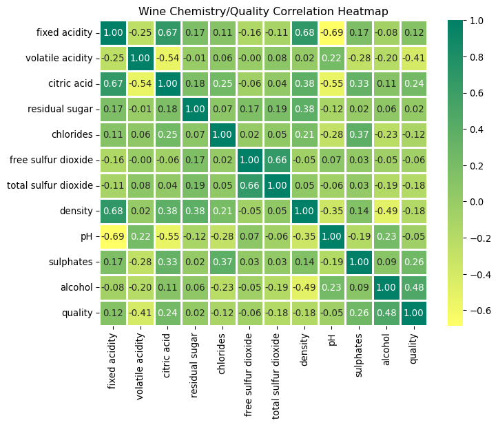
Let us now look at the correlation of the features with the target variable. Let us also drop all columns with a correlation of less than 0.2 with the target variable - this will help us reduce the number of features in our model, and help the model generalize better by focusing on the most important features.
About Dropping Features
In many cases, it is important to reduce the number of features in the model. This is because having too many features can lead to overfitting, and the model may not generalize well to new data. In this case, we are dropping features with a correlation of less than 0.2 with the target variable, as they are less likely to be important in predicting the quality of wine.
Show the code
# Plot a correlation chart of the features against the 'quality' target variable.# Calculate the correlation matrixcorrelation_matrix = wine.corr()# Identify features with correlation to 'quality' less than 0.2# Use absolute value to consider both positive and negative correlationsfeatures_to_keep = correlation_matrix.index[abs(correlation_matrix["quality"]) >=0.2]plt.figure(figsize=(8, 6))sns.heatmap( correlation_matrix, annot=True, cmap="summer_r", fmt=".2f", linewidths=2).set_title("Wine Chemistry/Quality Correlation Heatmap")plt.show()# Keep these features in the DataFrame, including the target variable 'quality'wine = wine[features_to_keep]
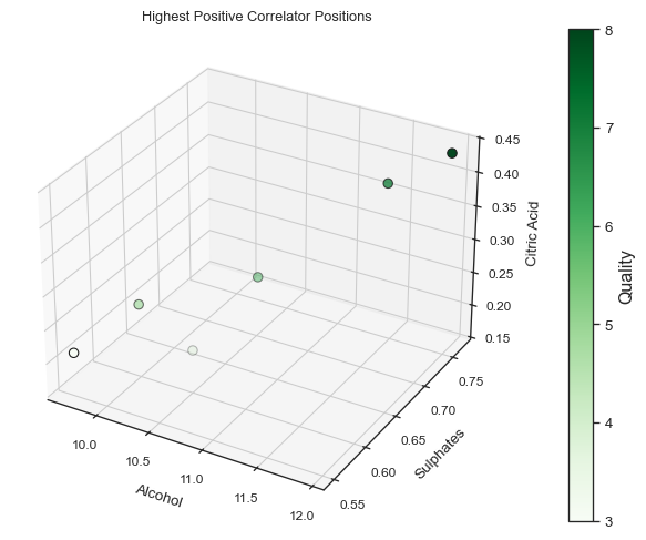
From this correlation matrix it becomes apparent that alcohol, sulphates, volatile acidity and citric acid are the features with the highest correlation with the target variable.
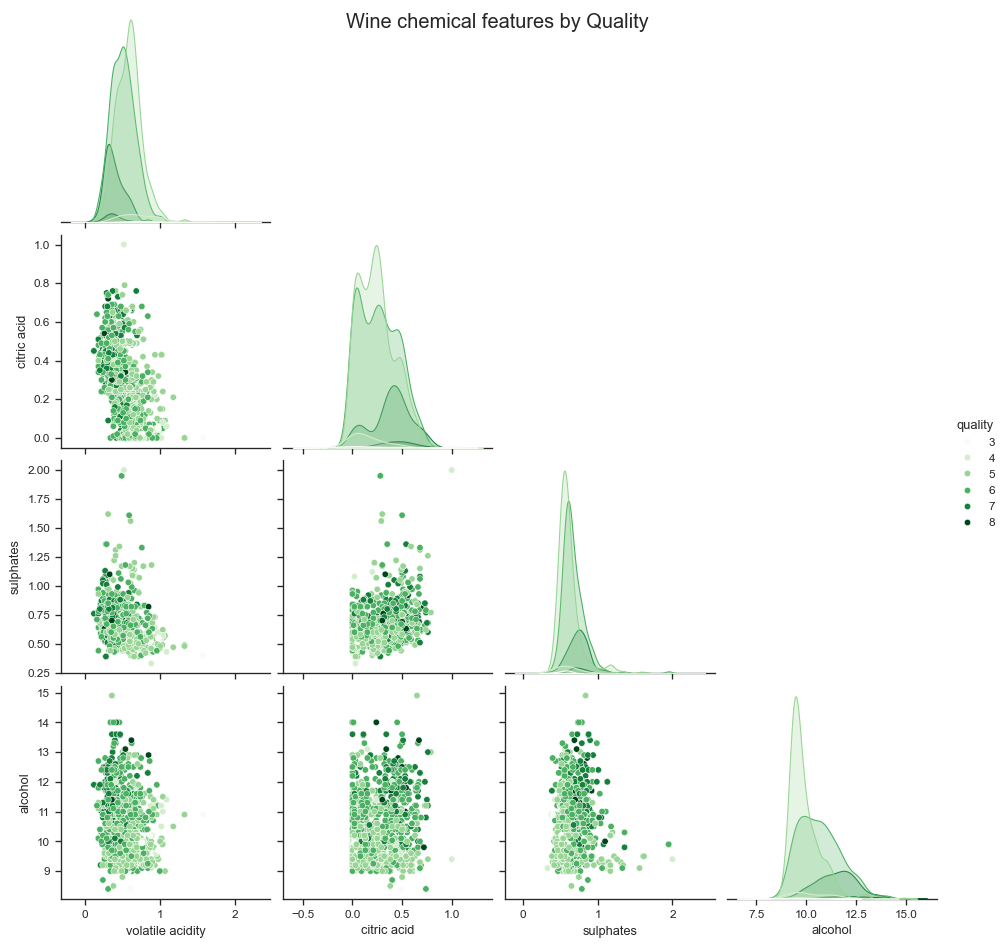
Now let us plot a matrix for the features to see how they are related to each other. This will help us understand the multicollinearity between the features, as effectively a chemical feature comparison. Notice how we now have a smaller number of features, as we dropped the ones with a correlation of less than 0.2 with the target variable.
Show the code
# Now let us chart a matrix of plots, with X vs Y between all features.# This will effectively give us a chemical composition matrix, where the color of the plot will indicate the quality.# Pair plot using seabornsns.set_theme(context="paper", style="ticks") # Set the style of the visualizationplt.figure(figsize=(8, 6))pairplot = sns.pairplot(wine, hue="quality", palette="Greens", corner=True)pairplot.figure.suptitle("Wine chemical features by Quality", size=15)plt.show()wine
<Figure size 768x576 with 0 Axes>
volatile acidity
citric acid
sulphates
alcohol
quality
0
0.700
0.00
0.56
9.4
5
1
0.880
0.00
0.68
9.8
5
2
0.760
0.04
0.65
9.8
5
3
0.280
0.56
0.58
9.8
6
4
0.700
0.00
0.56
9.4
5
...
...
...
...
...
...
1138
0.510
0.13
0.75
11.0
6
1139
0.620
0.08
0.82
9.5
6
1140
0.600
0.08
0.58
10.5
5
1141
0.550
0.10
0.76
11.2
6
1142
0.645
0.12
0.71
10.2
5
1143 rows × 5 columns
Now let us derive a second dataset, grouped by quality, where each featured is averaged. We will then use this to plot an aggregate positioning of the best correlated features.
And now let us plot the positioning for the three best correlators.
Show the code
fig = plt.figure(figsize=(8, 6))ax = fig.add_subplot(111, projection="3d")# Normalize 'quality' values for color mappingnorm = plt.Normalize( wine_grouped_by_quality["quality"].min(), wine_grouped_by_quality["quality"].max())colors = plt.get_cmap("Greens")(norm(wine_grouped_by_quality["quality"]))# 3D scatter plotsc = ax.scatter( wine_grouped_by_quality["alcohol"], wine_grouped_by_quality["sulphates"], wine_grouped_by_quality["citric acid"], c=colors, edgecolor="k", s=40, depthshade=True,)# Create a color bar with the correct mappingcbar = fig.colorbar(plt.cm.ScalarMappable(norm=norm, cmap="Greens"), ax=ax, pad=0.1)cbar.set_label("Quality", fontsize=12)# Set font size for the color bar tick labelscbar.ax.tick_params(labelsize=10) # Adjust labelsize as needed# Labels and titleax.set_xlabel("Alcohol", fontsize=10)ax.set_ylabel("Sulphates", fontsize=10)ax.set_zlabel("Citric Acid", fontsize=10)ax.set_title("Highest Positive Correlator Positions")# Set font size for the tick labels on all axesax.tick_params(axis="both", which="major", labelsize=9)ax.tick_params(axis="both", which="minor", labelsize=8)plt.show()
Evaluating different models
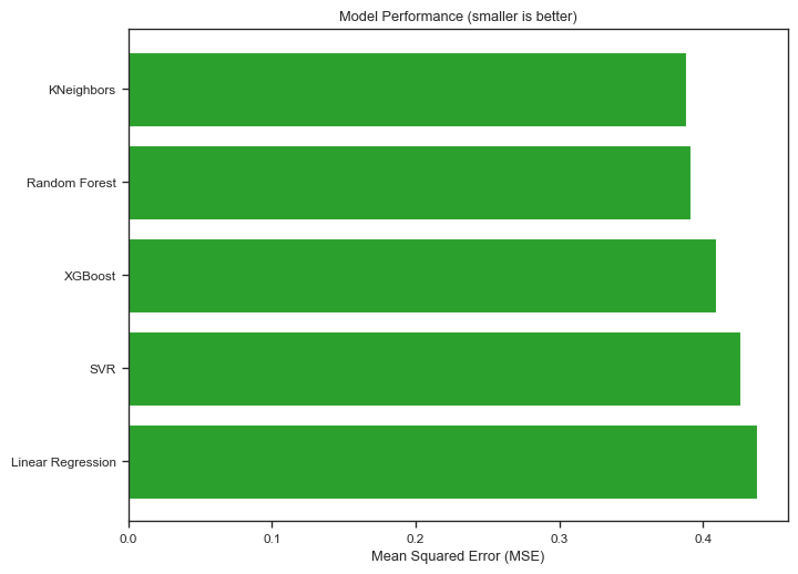
Let us now evaluate different models to predict the quality of the wine. We will use a pipeline to preprocess the data, and then evaluate the performance of different models. We will use the following models:
Linear Regression: A simple echnique for regression that assumes a linear relationship between the input variables (features) and the single output variable (quality). It is often used as a baseline for regression tasks.
Random Forest Regressor: An ensemble method that operates by constructing multiple decision trees during training time and outputting the average prediction of the individual trees. It is robust against overfitting and is often effective for a wide range of regression tasks.
SVR (Support Vector Regression): An extension of Support Vector Machines (SVM) to regression problems. SVR can efficiently perform linear and non-linear regression, capturing complex relationships between the features and the target variable.
XGBoost Regressor: A highly efficient and scalable implementation of gradient boosting framework. XGBoost is known for its speed and performance, and it has become a popular choice in data science competitions for its ability to handle sparse data and its efficiency in training.
KNeighbors Regressor: A type of instance-based learning or non-generalizing learning that does not attempt to construct a general internal model, but stores instances of the training data. Classification is computed from a simple majority vote of the nearest neighbors of each point.
For each model, we will scale the features using MinMaxScaler to ensure that all features contribute equally to the result. This is particularly important for models like SVR and KNeighbors Regressor, which are sensitive to the scale of the input features. We will then perform hyperparameter tuning to find the best parameters for each model, using GridSearchCV to systematically explore a range of parameters for each model. Finally, we will evaluate the performance of each model based on the negative mean squared error (neg_mean_squared_error), allowing us to identify the model that best predicts the quality of the wine.
Show the code
from sklearn.model_selection import GridSearchCVfrom sklearn.model_selection import train_test_split, GridSearchCV, cross_val_scorefrom sklearn.pipeline import Pipelinefrom sklearn.preprocessing import MinMaxScalerfrom sklearn.linear_model import LinearRegressionfrom sklearn.ensemble import RandomForestRegressorfrom sklearn.svm import SVRfrom sklearn.neighbors import KNeighborsRegressorfrom xgboost import XGBRegressorimport numpy as np# Split 'wine' into features (X, all columns except quality) and target (y, only quality)X = wine.drop("quality", axis=1)y = wine["quality"]# Split the dataset into training and testing setsX_train, X_test, y_train, y_test = train_test_split( X, y, test_size=0.2, random_state=42)# Define models and their respective parameter grids. Note that the parameter grid keys must be prefixed by the model name in the pipeline.models_params = [ ("Linear Regression", LinearRegression(), {}), ("Random Forest", RandomForestRegressor(), {"Random Forest__n_estimators": [10, 100, 200],"Random Forest__max_depth": [None, 10, 20, 30], }, ), ("SVR", SVR(), {"SVR__C": [0.1, 1, 10],"SVR__kernel": ["linear", "rbf"], }, ), ("XGBoost", XGBRegressor(), {"XGBoost__n_estimators": [100, 200, 400, 800],"XGBoost__learning_rate": [0.005, 0.01, 0.1, 0.2],"XGBoost__max_depth": [3, 5, 7, 9],"XGBoost__seed": [42], }, ), ("KNeighbors", KNeighborsRegressor(), {"KNeighbors__n_neighbors": [3, 5, 7, 9],"KNeighbors__weights": ["uniform", "distance"], }, ),]best_score =float("-inf")best_regressor =Nonebest_params =Nonemodel_names = []scores = []for name, regressor, params in models_params: pipeline = Pipeline( [ ("scaler", MinMaxScaler()), # Scale features (name, regressor), # Use the model name as the step name in the pipeline ] )if params:# Perform hyperparameter tuning for models with a defined parameter grid grid_search = GridSearchCV( pipeline, param_grid=params, cv=5, scoring="neg_mean_squared_error" ) grid_search.fit(X_train, y_train) score = grid_search.best_score_ params = grid_search.best_params_else:# For simplicity, directly evaluate models without a parameter grid score = np.mean( cross_val_score( pipeline, X_train, y_train, cv=5, scoring="neg_mean_squared_error" ) )# Store the model name and score model_names.append(name) scores.append(score)if score > best_score: best_score = score best_regressor = name best_params = params# Calculate MSE by negating the best_scoremse = best_score *-1print(f"Best regressor: {best_regressor} with neg_mean_squared_error score: {best_score}, MSE: {mse}, and parameters: {best_params}")# Pair each model name with its score, sort by score, and then unzip back into separate listssorted_pairs =sorted(zip(scores, model_names), key=lambda x: x[0])# Unzipping the sorted pairssorted_scores, sorted_model_names =zip(*sorted_pairs)# Plotting the performance of each model with sorted valuesfig, ax = plt.subplots(figsize=(8, 6))ax.barh(sorted_model_names, [score *-1for score in sorted_scores], color="#2CA02C")ax.set_xlabel("Mean Squared Error (MSE)")ax.set_title("Model Performance (smaller is better)")plt.show()
Best regressor: KNeighbors with neg_mean_squared_error score: -0.38768439914783254, MSE: 0.38768439914783254, and parameters: {'KNeighbors__n_neighbors': 9, 'KNeighbors__weights': 'distance'}
That’s great! We now know the best performing model!
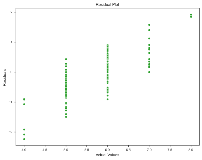
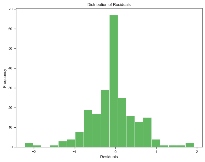
Now let us run some actual predictions with the best performing model, and plot residuals.
About Residuals
Residuals are the difference between the observed values and the predicted values. By plotting the residuals, we can visually inspect the performance of the model. Ideally, the residuals should be randomly distributed around zero, indicating that the model is making predictions without any systematic errors. If we observe a pattern in the residuals, it may indicate that the model is not capturing some underlying patterns in the data.
Show the code
from sklearn.metrics import mean_squared_error# Since we're using named steps in the pipeline, update `best_params` to work with `set_params`best_params_updated = { key.replace(f"{best_regressor}__", "", 1): valuefor key, value in best_params.items()}# Recreate the best pipeline with the best parametersif best_regressor =="Linear Regression": best_model = LinearRegression(**best_params_updated)elif best_regressor =="Random Forest": best_model = RandomForestRegressor(**best_params_updated)elif best_regressor =="SVR": best_model = SVR(**best_params_updated)elif best_regressor =="XGBoost": best_model = XGBRegressor(**best_params_updated)elif best_regressor =="KNeighbors": best_model = KNeighborsRegressor(**best_params_updated)# Initialize the pipeline with the best modelbest_pipeline = Pipeline([("scaler", MinMaxScaler()), (best_regressor, best_model)])# Retrain on the full training setbest_pipeline.fit(X_train, y_train)# Predict on the test sety_pred = best_pipeline.predict(X_test)residuals = y_test - y_pred# Calculate and print the MSE on the test set for evaluationtest_mse = mean_squared_error(y_test, y_pred)print(f"Test MSE for the best regressor ({best_regressor}): {test_mse}")# Print summary statistics of the residualsprint("Residuals Summary Statistics:")print(residuals.describe())# Residual plot using seaborn and matplotlibplt.figure(figsize=(8, 6))sns.scatterplot(x=y_test, y=residuals, color="#2CA02C")plt.axhline(y=0, linestyle="--", color="red") # Adding a horizontal line at 0plt.title("Residual Plot")plt.xlabel("Actual Values")plt.ylabel("Residuals")plt.show()# Histogram of residualsplt.figure(figsize=(8, 6))sns.histplot(residuals, kde=False, color="#2CA02C", bins=20)plt.title("Distribution of Residuals")plt.xlabel("Residuals")plt.ylabel("Frequency")plt.show()
Test MSE for the best regressor (KNeighbors): 0.33814990556399543
Residuals Summary Statistics:
count    229.000000
mean      -0.048154
std        0.580779
min       -2.233049
25%       -0.351151
50%        0.000000
75%        0.241689
max        1.923910
Name: quality, dtype: float64
Final remarks
In this experiment, we have explored the Wine Quality Dataset from Kaggle, preprocessed the data, and evaluated different models to predict the quality of wine. We have used a pipeline to preprocess the data, and evaluated the performance of different models using hyperparameter tuning and cross-validation. We have identified the best performing model based on the negative mean squared error, and used it to make predictions on the test set. Finally, we have plotted the residuals to visually inspect the performance of the model.
This is a typical workflow in a machine learning project, where we preprocess the data, evaluate different models, and select the best performing model for making predictions. We have used a variety of models in this experiment, including Linear Regression, Random Forest Regressor, SVR, XGBoost Regressor, and KNeighbors Regressor. Each of these models has its strengths and weaknesses, and it is important to evaluate their performance on the specific dataset to identify the best model for the task at hand.