using machine learning for a common industrial and engineering application
Experiments
Machine Learning
Published
May 11, 2024
Predictive maintenance leverages machine learning to analyze operational data, anticipate potential failures, and schedule timely maintenance. This approach helps avoid unexpected downtime and extends the lifespan of equipment.
In the automotive industry, companies like Tesla are integrating machine learning to predict vehicle component failures before they occur. This is achieved by analyzing data from various sensors in the vehicle, enabling proactive replacement of parts and software updates that enhance performance and safety.
In aviation, predictive maintenance can be particularly critical. Airlines utilize machine learning models to monitor aircraft health in real-time, analyzing data from engines and other critical systems to predict failures. For example, GE uses its Predix platform to process data from aircraft engines, predict when maintenance is needed, and reduce unplanned downtime.
The manufacturing sector also benefits from predictive maintenance. Siemens uses machine learning in its Insights Hub platform to analyze operational data from industrial machinery. This enables them to predict failures and optimize maintenance schedules, thereby improving efficiency and reducing costs.
Energy companies are also applying these techniques to predict the maintenance needs of infrastructure like wind turbines and pipelines. This proactive approach not only ensures operational efficiency but also helps in preventing environmental hazards.
In this exercise, we will explore a simple predictive maintenance scenario using machine learning. We will use a dataset that simulates the sensor data from a car engine, and build a model to predict when an engine is likely running abnormally and might require maintenance.
We will use a simple dataset covering data from various sensors, and a target variable indicating whether the engine is running normally or abnormally.
Warning: Looks like you're using an outdated API Version, please consider updating (server 1.7.4.2 / client 1.6.17)
Dataset URL: https://www.kaggle.com/datasets/parvmodi/automotive-vehicles-engine-health-dataset
License(s): CC0-1.0
Downloading automotive-vehicles-engine-health-dataset.zip to .data
  0%|                                                | 0.00/595k [00:00<?, ?B/s]100%|████████████████████████████████████████| 595k/595k [00:00<00:00, 3.16MB/s]
100%|████████████████████████████████████████| 595k/595k [00:00<00:00, 3.15MB/s]
Show the code
# Load engine data from dataset into a pandas dataframeimport pandas as pdengine = pd.read_csv(".data/engine_data.csv")
Dataset
As in any ML task, let’s start by understanding the content of the dataset.
Show the code
engine
Engine rpm
Lub oil pressure
Fuel pressure
Coolant pressure
lub oil temp
Coolant temp
Engine Condition
0
700
2.493592
11.790927
3.178981
84.144163
81.632187
1
1
876
2.941606
16.193866
2.464504
77.640934
82.445724
0
2
520
2.961746
6.553147
1.064347
77.752266
79.645777
1
3
473
3.707835
19.510172
3.727455
74.129907
71.774629
1
4
619
5.672919
15.738871
2.052251
78.396989
87.000225
0
...
...
...
...
...
...
...
...
19530
902
4.117296
4.981360
4.346564
75.951627
87.925087
1
19531
694
4.817720
10.866701
6.186689
75.281430
74.928459
1
19532
684
2.673344
4.927376
1.903572
76.844940
86.337345
1
19533
696
3.094163
8.291816
1.221729
77.179693
73.624396
1
19534
504
3.775246
3.962480
2.038647
75.564313
80.421421
1
19535 rows × 7 columns
As we can see it is composed of various sensor data and a target variable indicating whether the engine is running normally or abnormally. Let’s make sure there’s no missing data.
# Show a data summary, excluding the 'Engine Condition' columnengine.drop("Engine Condition", axis=1, inplace=False).describe().drop("count").style.background_gradient(cmap="Greens")
Engine rpm
Lub oil pressure
Fuel pressure
Coolant pressure
lub oil temp
Coolant temp
mean
791.239263
3.303775
6.655615
2.335369
77.643420
78.427433
std
267.611193
1.021643
2.761021
1.036382
3.110984
6.206749
min
61.000000
0.003384
0.003187
0.002483
71.321974
61.673325
25%
593.000000
2.518815
4.916886
1.600466
75.725990
73.895421
50%
746.000000
3.162035
6.201720
2.166883
76.817350
78.346662
75%
934.000000
4.055272
7.744973
2.848840
78.071691
82.915411
max
2239.000000
7.265566
21.138326
7.478505
89.580796
195.527912
The dataset consists of various parameters related to engine performance and maintenance. Engine rpm shows a mean of approximately 791 with a standard deviation of about 268, indicating moderate variability in engine speeds across different observations. Lubrication oil pressure averages around 3.30 with a standard deviation of just over 1, suggesting some fluctuations in oil pressure which might affect engine lubrication and performance.
Fuel pressure has an average value near 6.66 and a standard deviation of approximately 2.76, pointing to considerable variation that could influence fuel delivery and engine efficiency. Similarly, coolant pressure, averaging at about 2.34 with a standard deviation of around 1.04, displays notable variability which is critical for maintaining optimal engine temperature.
Lubrication oil temperature and coolant temperature have averages of roughly 77.64°C and 78.43°C, respectively, with lubrication oil showing less temperature variability (standard deviation of about 3.11) compared to coolant temperature (standard deviation of approximately 6.21). This temperature stability is crucial for maintaining engine health, yet the wider range in coolant temperature could indicate different cooling needs or system efficiencies among the units observed.
Overall, while there is a general consistency in the central values of these parameters, the variability highlighted by the standard deviations and the range between minimum and maximum values underline the complexities and differing conditions under which the engines operate.
To avoid any errors further down in the pipeline, let’s also rename all columns so they do not have any whitespaces - this is not strictly necessary, but it can help avoid issues later on.
Show the code
# To avoid issues further down, let us rename the columns to remove spacesengine.columns = engine.columns.str.replace(" ", "_")
Show the code
# Split the data into features and targetX = engine.drop("Engine_Condition", axis=1)y = engine["Engine_Condition"]y.value_counts()
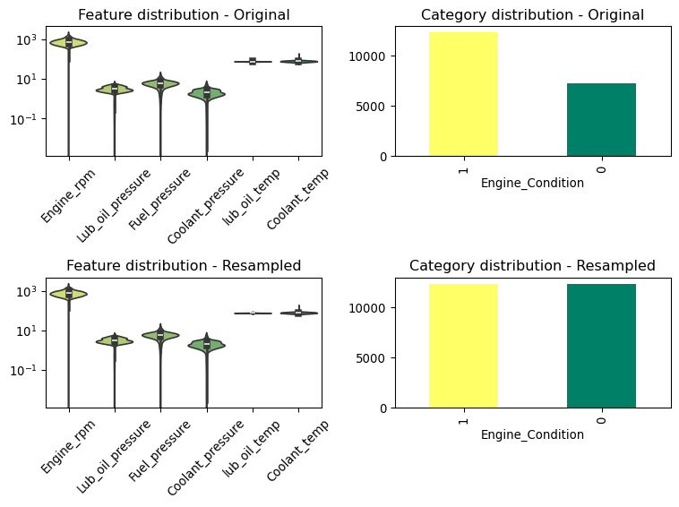
Notice the imbalance in the target variable Engine_Condition, with a split between categories of 58%/42%. This imbalance could affect the model’s ability to learn the patterns in the data, especially if the minority class (abnormal engine operation) is underrepresented. We will address this issue with a resampling technique called SMOTE.
Show the code
# There is a class imbalance in the target variable. We will use the SMOTE technique to balance the classes.from imblearn.over_sampling import SMOTEsm = SMOTE(random_state=42)X_resampled, y_resampled = sm.fit_resample(X, y)
About SMOTE
SMOTE stands for Synthetic Minority Over-sampling Technique. It’s a statistical technique for increasing the number of cases in a dataset in a balanced way. SMOTE works by creating synthetic samples rather than by oversampling with replacement. It’s particularly useful when dealing with imbalanced datasets, where one class is significantly outnumbered by the other(s).
The way SMOTE works is by first selecting a minority class instance and then finding its k-nearest minority class neighbors. The synthetic instances are then created by choosing one of the k-nearest neighbors and drawing a line between the two in feature space. The synthetic instances are points along the line, randomly placed between the two original instances. This approach not only augments the dataset size but also helps to generalize the decision boundaries, as the synthetic samples are not copies of existing instances but are instead new, plausible examples constructed in the feature space neighborhood of existing examples.
By using SMOTE, the variance of the minority class increases, which can potentially improve the classifier’s performance by making it more robust and less likely to overfit the minority class based on a small number of samples. This makes it particularly useful in scenarios where acquiring more examples of the minority class is impractical.
Visualising the distributions
Now that we have balanced the target classes, let’s visualize the distributions of the features to understand their spread and identify any patterns or outliers. This will help us determine which features are most relevant for predicting engine condition, if any.
Show the code
import seaborn as snsimport matplotlib.pyplot as pltimport numpy as npdef plot_violin(data, ax):# Create a violin plot using the specified color palette sns.violinplot(data=data, palette="summer_r", ax=ax)# Rotate x-tick labels for better readability - apply to the specific axes ax.tick_params(axis="x", rotation=45)# Apply a log scale to the y-axis of the specific axes ax.set_yscale("log")return axdef plot_bar(data, ax):# Get the unique values and their frequency value_counts = data.value_counts()# Generate a list of colors, one for each unique value colors = plt.cm.summer_r(np.linspace(0, 1, num=len(value_counts)))# Plot with a different color for each bar value_counts.plot(kind="bar", color=colors, ax=ax)return plt# Plot the distribution of the resampled features, together with the original features as a facet gridfig, axs = plt.subplots(2, 2, figsize=(8, 6)) # Create a 2x2 grid of subplotsplot_violin(X, ax=axs[0, 0])plot_bar(y, ax=axs[0, 1])plot_violin(X_resampled, ax=axs[1, 0])plot_bar(y_resampled, ax=axs[1, 1])axs[0, 0].set_title("Feature distribution - Original")axs[0, 1].set_title("Category distribution - Original")axs[1, 0].set_title("Feature distribution - Resampled")axs[1, 1].set_title("Category distribution - Resampled")plt.tight_layout()plt.show()
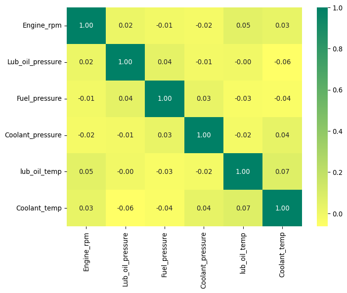
We see the expected spread as indicated before. Another important step is to understand if there is a clear correlation between the features and the target variable. This can be done by plotting a correlation matrix.
Show the code
# Plot a correlation matrix of the featurescorr = X_resampled.corr()plt.figure(figsize=(8, 6))sns.heatmap(corr, annot=True, cmap="summer_r", fmt=".2f")plt.show()
Notice how there are no strong correlations between the features and the target variable. This suggests that the features might not be linearly related to the target, and more complex relationships might be at play, or that the features are not informative enough to predict the target variable.
It points at needing to use more advanced models to capture the underlying patterns in the data, rather than simple linear models.
Reducing dimensionality for analysis
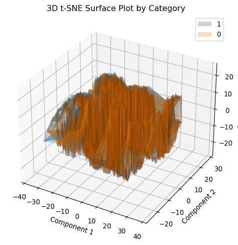
To further understand the data, we can reduce the dimensionality of the dataset using t-SNE (t-distributed Stochastic Neighbor Embedding). This technique is useful for visualizing high-dimensional data in 2D or 3D, allowing us to explore the data’s structure and identify any clusters or patterns.
Show the code
from mpl_toolkits.mplot3d import Axes3Dfrom matplotlib.tri import Triangulationfrom sklearn.manifold import TSNE# t-SNE transformationtsne = TSNE(n_components=3, random_state=42)X_tsne = tsne.fit_transform(X_resampled)df_tsne = pd.DataFrame(X_tsne, columns=["Component 1", "Component 2", "Component 3"])df_tsne["y"] = y_resampledfig = plt.figure(figsize=(8, 6))ax = fig.add_subplot(111, projection="3d")# Define unique categories and assign a color from tab10 for eachcategories = df_tsne["y"].unique()colors = plt.cm.tab10(range(len(categories)))for cat, color inzip(categories, colors): df_cat = df_tsne[df_tsne["y"] == cat]iflen(df_cat) <3:# Fallback: not enough points for a surface, so scatter them. ax.scatter( df_cat["Component 1"], df_cat["Component 2"], df_cat["Component 3"], color=color, label=str(cat), )else:# Create triangulation based on the first two components triang = Triangulation(df_cat["Component 1"], df_cat["Component 2"]) ax.plot_trisurf( df_cat["Component 1"], df_cat["Component 2"], df_cat["Component 3"], triangles=triang.triangles, color=color, alpha=0.25, label=str(cat), )ax.set_title("3D t-SNE Surface Plot by Category")ax.set_xlabel("Component 1")ax.set_ylabel("Component 2")ax.set_zlabel("Component 3")ax.legend()plt.show()
That makes for an interesting structure, but unfortunately it doesn’t seem to show any clear separation between the two classes. This could indicate that the data is not easily separable in the feature space, which might make it challenging to build a model that accurately predicts engine condition based on these features. However, it’s still worth exploring different models to see if they can capture the underlying patterns in the data.
Testing a prediction model
We have mentioned that the features might not be linearly related to the target variable, and more complex relationships might be at play. To address this, we can use a Random Forest classifier, which is an ensemble learning method that combines multiple decision trees to improve predictive performance. Random Forest models are known for their robustness and ability to capture complex relationships in the data, making them suitable for this task.
First we will split the data into training and testing sets, and then train the Random Forest model on the training data. We will evaluate the model’s performance on the test data using metrics such as accuracy, precision, recall, and F1 score. Notice how we are stratifying the split to ensure that the distribution of the target variable is preserved in both the training and testing sets.
Show the code
# Create a train-test split of the datafrom sklearn.model_selection import train_test_splitX_train, X_test, y_train, y_test = train_test_split( X_resampled, y_resampled, test_size=0.2, stratify=y_resampled, random_state=42)
Let’s now train the Random Forest Model and evaluate its performance. We will do this by searching for the best hyperparameters using a grid search.
Show the code
# Do a grid search to find the best hyperparameters for a Random Forest Classifierfrom sklearn.ensemble import RandomForestClassifierfrom sklearn.model_selection import GridSearchCVfrom sklearn.metrics import classification_reportparam_grid = {"n_estimators": [25, 50, 100],"max_depth": [5, 10, 20],"min_samples_split": [2, 5, 10],"min_samples_leaf": [1, 2, 4],}rf = RandomForestClassifier(random_state=42)grid_search = GridSearchCV( estimator=rf, param_grid=param_grid, cv=5, n_jobs=-1, verbose=1)grid_search.fit(X_train, y_train)grid_search.best_params_# Train the model with the best hyperparametersrf_best = grid_search.best_estimator_rf_best.fit(X_train, y_train)# Evaluate the modely_pred = rf_best.predict(X_test)print(classification_report(y_test, y_pred))
Fitting 5 folds for each of 81 candidates, totalling 405 fits
              precision    recall  f1-score   support

           0       0.69      0.74      0.71      2464
           1       0.72      0.66      0.69      2463

    accuracy                           0.70      4927
   macro avg       0.70      0.70      0.70      4927
weighted avg       0.70      0.70      0.70      4927
That’s an ok(ish) performance, but this was somewhat expected given the lack of strong correlations between the features and the target variable. However, the Random Forest model is able to capture some of the underlying patterns in the data, achieving an accuracy of around 70% on the test set.
About Model Accuracy
In a balanced binary classification scenario where each class has a 50% probability, random guessing would typically result in an accuracy of 50%. If a model achieves an accuracy of 70%, it is performing better than random guessing by a margin of 20 percentage points.
To further quantify this improvement:
Random Guessing Accuracy: 50%
Model Accuracy: 70%
Improvement: \((70\% - 50\% = 20\%)\)
This means the model’s accuracy is 40% better than what would be expected by random chance, calculated by the formula:
Thus, the model is performing significantly better than random guessing in this balanced classification problem. This is a good indication that it is learning and able to effectively discriminate between the two classes beyond mere chance.
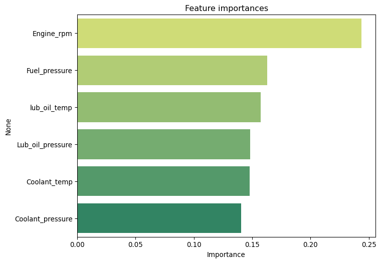
Let us now look at the feature importances, as determined by the model. This will help us understand which features are most relevant for predicting engine condition.
In this exercise, we explored a simple predictive maintenance scenario using machine learning. We used a dataset simulating sensor data from a car engine and built a Random Forest model to predict when an engine is likely running abnormally and might require maintenance.
Limitations
The dataset in this example was small, which could limit the model’s ability to generalize to new data. In practice, having more data would be beneficial for training a more robust model that can capture the underlying patterns in the data more effectively.
We reached an accuracy of around 70% on the test set, indicating that the model is able to capture some of the underlying patterns in the data. However, the lack of strong correlations between the features and the target variable suggests that more complex relationships might be at play, which could be challenging to capture with the current features. Therefore it would be worth considering additional features in such a scenario.
As an exercise, maybe you can think of what features you would consider to increase the chance of a more reliable predictor in this scenario ?