By now we have covered a few basics - we learnt about different data types including lists, sequences and dictionaries, and we learnt how to use loops and conditions to manipulate data. We also learnt how to define simple functions, and how to load external modules to extend the functionality of Python.
Let us now dive a bit deeper into data, how to manipulate it, and how to use it to answer questions and get some insights. We will use the pandas library to work with data, and the matplotlib library to visualize it.
Learning Objectives
The pandas library is a powerful, yet large library that is used for data manipulation and analysis. We will only scratch the surface of what it can do in this book. As you progress, you can and should refer to the official documentation to learn more, and to hone your skills.
Data and datasets
You will likely have come accross some data before that you had to work with, perhaps in Excel. There are also lots of different public datasets available online that you can use to practice your data analysis skills. A great resource for this is Kaggle, where you can find datasets on a wide range of topics.
For this section, we will use a public dataset from Kaggle which includes earthquake data from around the world. You can download the dataset from this link. The dataset is in CSV format, which by now you should be familiar with and can load.
Downloading the dataset
There are several ways to get a public dataset into your computer - you can download it directly from the website, or you can use the kaggle command line tool to download it. Because we are practicing some programming skills, we will use the command line tool to download the dataset.
To install it you can use conda, as follows:
conda install -c conda-forge kaggle
Once you have installed the tool, you need to create a profile in Kaggle and create an API key. Instead of rewriting the instructions here, just follow the excellent instructions by Christian Mills in this blog post.
Once you have your API key, you can download the dataset using the following command:
kaggle datasets download usgs/earthquake-database
About Downloading Datasets
:class: tip, dropdown There are other ways to download the dataset, such as using packages like Kagglehub, or mlcroissant. But for now we will use the command line tool as the other approaches are programmatic.
Your new dataset will be in a compressed zip file named earthquake-database.zip ready to be explored!
Loading and working with data
Pandas can unpack zip files directly, let us see how to do it.
import pandas as pd# Read the CSV directly from the zipearthquakes = pd.read_csv("earthquake-database.zip", compression="zip")earthquakes.head(10)
Date
Time
Latitude
Longitude
Type
Depth
Depth Error
Depth Seismic Stations
Magnitude
Magnitude Type
...
Magnitude Seismic Stations
Azimuthal Gap
Horizontal Distance
Horizontal Error
Root Mean Square
ID
Source
Location Source
Magnitude Source
Status
0
01/02/1965
13:44:18
19.246
145.616
Earthquake
131.6
NaN
NaN
6.0
MW
...
NaN
NaN
NaN
NaN
NaN
ISCGEM860706
ISCGEM
ISCGEM
ISCGEM
Automatic
1
01/04/1965
11:29:49
1.863
127.352
Earthquake
80.0
NaN
NaN
5.8
MW
...
NaN
NaN
NaN
NaN
NaN
ISCGEM860737
ISCGEM
ISCGEM
ISCGEM
Automatic
2
01/05/1965
18:05:58
-20.579
-173.972
Earthquake
20.0
NaN
NaN
6.2
MW
...
NaN
NaN
NaN
NaN
NaN
ISCGEM860762
ISCGEM
ISCGEM
ISCGEM
Automatic
3
01/08/1965
18:49:43
-59.076
-23.557
Earthquake
15.0
NaN
NaN
5.8
MW
...
NaN
NaN
NaN
NaN
NaN
ISCGEM860856
ISCGEM
ISCGEM
ISCGEM
Automatic
4
01/09/1965
13:32:50
11.938
126.427
Earthquake
15.0
NaN
NaN
5.8
MW
...
NaN
NaN
NaN
NaN
NaN
ISCGEM860890
ISCGEM
ISCGEM
ISCGEM
Automatic
5
01/10/1965
13:36:32
-13.405
166.629
Earthquake
35.0
NaN
NaN
6.7
MW
...
NaN
NaN
NaN
NaN
NaN
ISCGEM860922
ISCGEM
ISCGEM
ISCGEM
Automatic
6
01/12/1965
13:32:25
27.357
87.867
Earthquake
20.0
NaN
NaN
5.9
MW
...
NaN
NaN
NaN
NaN
NaN
ISCGEM861007
ISCGEM
ISCGEM
ISCGEM
Automatic
7
01/15/1965
23:17:42
-13.309
166.212
Earthquake
35.0
NaN
NaN
6.0
MW
...
NaN
NaN
NaN
NaN
NaN
ISCGEM861111
ISCGEM
ISCGEM
ISCGEM
Automatic
8
01/16/1965
11:32:37
-56.452
-27.043
Earthquake
95.0
NaN
NaN
6.0
MW
...
NaN
NaN
NaN
NaN
NaN
ISCGEMSUP861125
ISCGEMSUP
ISCGEM
ISCGEM
Automatic
9
01/17/1965
10:43:17
-24.563
178.487
Earthquake
565.0
NaN
NaN
5.8
MW
...
NaN
NaN
NaN
NaN
NaN
ISCGEM861148
ISCGEM
ISCGEM
ISCGEM
Automatic
10 rows × 21 columns
There’s a few new things there. We loaded the file with read_csv as we encountered before, but this time we passed the compression argument to specify that the file is compressed. We also used the head method to show the first 10 rows of the dataframe. This is a very useful method to quickly check the contents of a dataset.
Pandas offers a few other methods to quickly check the contents of a dataframe, such as info and describe. Let us see how they work.
earthquakes.describe()
Latitude
Longitude
Depth
Depth Error
Depth Seismic Stations
Magnitude
Magnitude Error
Magnitude Seismic Stations
Azimuthal Gap
Horizontal Distance
Horizontal Error
Root Mean Square
count
23412.000000
23412.000000
23412.000000
4461.000000
7097.000000
23412.000000
327.000000
2564.000000
7299.000000
1604.000000
1156.000000
17352.000000
mean
1.679033
39.639961
70.767911
4.993115
275.364098
5.882531
0.071820
48.944618
44.163532
3.992660
7.662759
1.022784
std
30.113183
125.511959
122.651898
4.875184
162.141631
0.423066
0.051466
62.943106
32.141486
5.377262
10.430396
0.188545
min
-77.080000
-179.997000
-1.100000
0.000000
0.000000
5.500000
0.000000
0.000000
0.000000
0.004505
0.085000
0.000000
25%
-18.653000
-76.349750
14.522500
1.800000
146.000000
5.600000
0.046000
10.000000
24.100000
0.968750
5.300000
0.900000
50%
-3.568500
103.982000
33.000000
3.500000
255.000000
5.700000
0.059000
28.000000
36.000000
2.319500
6.700000
1.000000
75%
26.190750
145.026250
54.000000
6.300000
384.000000
6.000000
0.075500
66.000000
54.000000
4.724500
8.100000
1.130000
max
86.005000
179.998000
700.000000
91.295000
934.000000
9.100000
0.410000
821.000000
360.000000
37.874000
99.000000
3.440000
The describe method gives us a summary of the numerical columns in the dataframe. It shows the count of non-null values, the mean, standard deviation, minimum, maximum, and the quartiles of the data. This is a very useful method to quickly get an idea of the distribution of the data.
info on the other hand gives us a summary of the dataframe, including the number of non-null values in each column (remember back to types of data), the data type of each column, and the memory usage of the dataframe. This is useful to quickly check if there are any missing values. In the above output we can see that there are 23412 entries in the dataframe, and that there are some columns with missing data (Depth Error for example).
The importance of data quality
Data quality is a very important aspect of data analysis. If the data is not clean, the results of the analysis will not be reliable. There are many ways in which data can be of poor quality, such as missing, incorrect or inconsistent values. It is important to always check the quality of the data before starting any analysis, and Pandas offers a few methods to help with this.
Before you make use of a dataset, it is a good idea to perform a few checks to ensure that the data is clean. These can include:
Checking for missing values
Checking for duplicate values
Checking for incorrect values
Let us see how to do this with the earthquake dataset for a few simple cases. In practice, checking for correctness of a dataset can be a bit of an art requiring specific domain knowledge, but we will cover some basic cases here.
Checking for missing values
Frequently columns in a dataset will have missing or incomplete data. Pandas can handle missing data in a few ways, such as dropping the rows with missing data, filling the missing data with a value, or interpolating the missing data. Let us see what this looks like by showing the series for the Depth Error column.
Notice how the range is 0 to 23411, but how the Non-Null Count is only 4461. This means that there are 18951 missing values in this column. We can use the isnull method to check for missing values across all columns in the dataframe.
earthquakes.isnull().sum()
Date                              0
Time                              0
Latitude                          0
Longitude                         0
Type                              0
Depth                             0
Depth Error                   18951
Depth Seismic Stations        16315
Magnitude                         0
Magnitude Type                    3
Magnitude Error               23085
Magnitude Seismic Stations    20848
Azimuthal Gap                 16113
Horizontal Distance           21808
Horizontal Error              22256
Root Mean Square               6060
ID                                0
Source                            0
Location Source                   0
Magnitude Source                  0
Status                            0
dtype: int64
Quite a few columns have missing values, such as Depth Error, Depth Seismic Stations, Magnitude Error, and Magnitude Seismic Stations.
Let us see what missing values look like in the dataframe.
earthquakes["Depth Error"]
0        NaN
1        NaN
2        NaN
3        NaN
4        NaN
        ...
23407    1.2
23408    2.0
23409    1.8
23410    1.8
23411    2.2
Name: Depth Error, Length: 23412, dtype: float64
The entries with missing values are shown as NaN, which stands for “Not a Number”.
Pandas offers a few methods to handle missing values, such as dropna (will drop any rows with missing values), fillna (substitutes a missing value with a prescribed value), and interpolate (will fill in missing values with interpolated values).
As an example, let us drop any rows with a missing Magnitude Type.
The dropna method has a few arguments that can be used to customize the behavior. In the example above, we used the subset argument to specify that we only want to drop rows where the Magnitude Type column is missing. We also used the ignore_index argument to reset the index of the dataframe after dropping the rows.
About the ignore_index argument
Dataframes in Pandas always have an index which is used to identify the rows. When you drop rows from a dataframe, the index is not automatically reset. This can be a problem if you want to iterate over the rows of the dataframe, as the index will have gaps. The ignore_index argument can be used to reset the index after dropping rows. You will come across many cases where you will need to reset the index of a dataframe, so it is good to be aware of this.
Let us now look at the dataframe again to see if the rows with missing Magnitude Type have been dropped.
We now see 23409 entries in the dataframe, which means that 3 rows were dropped as expected, and RangeIndex correctly shows an index from 0 to 23408.
We could perform similar operations for other columns with missing values, such as Depth Error, Depth Seismic Stations, Magnitude Error, and Magnitude Seismic Stations, but for now we will leave it at that as we are just exemplifying the process.
Checking for duplicate values
Another common problem in datasets is duplicate values. These can occur for a variety of reasons, such as data entry errors, or errors in the data collection process. Pandas offers a few methods to check for duplicate values, such as duplicated and drop_duplicates.
As an example, let us check for duplicate values in the ID column. We do this by using the duplicated method, which returns a boolean series indicating whether a value is duplicated or not, and then using the sum method to count the number of duplicates.
earthquakes.duplicated(subset=["ID"]).sum()
0
The result was 0, which means that there are no duplicate values in the ID column, good!
Let us now check to try and find duplicate Latitude and Longitude values, as these could indicate that the same earthquake was recorded more than once by the same, or different stations.
Checking for incorrect values in a dataset can be a bit more challenging, as it requires some domain knowledge. For argument’s sake, let us check for large Horizontal Error values (in the dataset, Horizontal Error is the horizontal error of the location of the earthquake in kilometers, and let us assume that it should not be larger than 90 km).
(earthquakes["Horizontal Error"] >90).sum()
14
The above expression earthquakes['Horizontal Error'] > 90 returns a boolean series indicating whether the condition is met or not, and then we use the sum method to count the number of values that meet the condition. In this case, there are 14 earthquakes with a Horizontal Error larger than 90 km, which could be incorrect values. Let us now drop these rows.
The above code has a few more details than what we have seen until now. It works by first selecting the rows that meet the condition earthquakes['Horizontal Error'] > 90, and then using the index attribute to get the index (0, 1, 2, etc.) of the rows that meet the condition. We then use the drop method to drop these rows, and finally use the reset_index method to reset the index of the dataframe as we have seen before when using the ignore_index argument of the dropna method.
Let’s now check the dataframe to see if the rows with large Horizontal Error values have been dropped.
(earthquakes["Horizontal Error"] >90).sum()
0
Perfect! No more rows with large Horizontal Error values!
Performing simple exploratory data analysis
Now that we have cleaned the data, we can start performing some analysis. By analysis we mean answering questions about the data, such as:
What is the average magnitude of earthquakes in the dataset?
What is the average depth of earthquakes ?
How many earthquakes were recorded per year ?
What is the average number of stations that recorded an earthquake ?
Calculating mean values
earthquakes["Magnitude"].describe()
count    23389.000000
mean         5.882655
std          0.423149
min          5.500000
25%          5.600000
50%          5.700000
75%          6.000000
max          9.100000
Name: Magnitude, dtype: float64
This code simply uses the describe method to show the summary statistics of the Magnitude column, which includes the mean value, as well as the standard deviation, minimum, maximum, and quartiles. Alternatively, we could calculate the mean value directly.
earthquakes["Magnitude"].mean()
5.882655094275087
Distribution of data
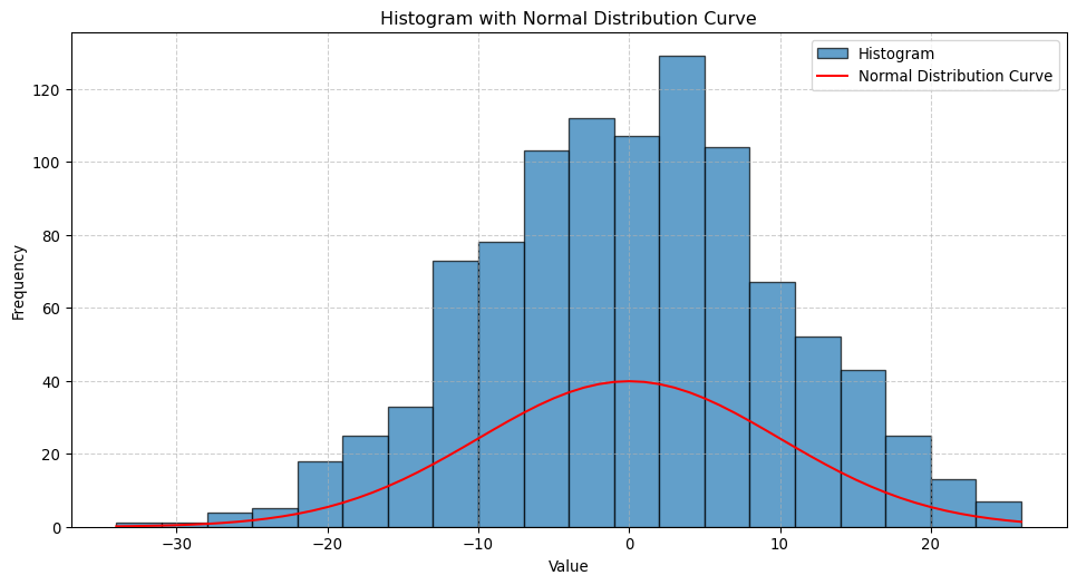
One important aspect of data analysis is understanding the distribution of the data. This can be done by plotting histograms or density charts, which show the frequency of values in a dataset. As an example, let us look at the distribution of the Magnitude column.
About Data Distribution
Understanding the distribution of data is very important in data analysis, as it can help identify patterns and trends. For example, if the data is normally distributed, we can use statistical methods that assume a normal distribution. If the data is not normally distributed, we may need to use non-parametric methods instead.
A great introduction to statistics if you haven’t looked very deeply into the topic is Shafer and Zhang’s Introductory Statistics.
import numpy as npimport matplotlib.pyplot as pltfrom scipy.stats import norm# Generate normally distributed integersnormal_integers = np.random.normal(loc=0, scale=10, size=1000)normal_integers = np.round(normal_integers).astype(int)# Generate data for the line (fitted normal distribution)x = np.arange(min(normal_integers), max(normal_integers) +1)pdf = norm.pdf(x, loc=0, scale=10) # Normal PDF based on the original distributionpdf_scaled = pdf *len(normal_integers) * (x[1] - x[0]) # Scale to match histogram# Plot the histogramplt.figure(figsize=(12, 6))plt.hist(normal_integers, bins=20, edgecolor="black", alpha=0.7, label="Histogram")# Overlay the lineplt.plot(x, pdf_scaled, color="red", label="Normal Distribution Curve")# Add labels and titleplt.title("Histogram with Normal Distribution Curve")plt.xlabel("Value")plt.ylabel("Frequency")plt.legend()plt.grid(True, linestyle="--", alpha=0.6)# Show the plotplt.show()
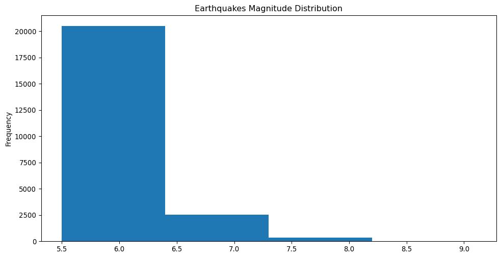
The usual process to understand a distribution is by dividing the data into ranges (also called “bins”), and then counting the number of values in each range. This is what the histogram shows. Let us see how this works.
This code uses the value_counts method to count the number of earthquake magnitudes into four bins (bins=4), and returns a series with the counts. Any numerical columns in a dataframe can be divided into bins using this method.
We can also plot the histogram for the Magnitude column using the plot method and the hist plot kind.
This creates a compelling visualisation of the distribution of magnitudes, and we can see there are a lot of earthquakes with small magnitudes!
Understanding the relationship between variables
Another important aspect of data analysis is understanding the relationship between variables. This can be done by computing the correlation between variables, which measures how closely related two variables are. The correlation coefficient ranges from -1 to 1, where -1 indicates a perfect negative correlation, 1 indicates a perfect positive correlation, and 0 indicates no correlation.
Pandas offers a corr method to compute the correlation between variables. Let us see how this works.
earthquakes[["Magnitude", "Depth"]].corr()
Magnitude
Depth
Magnitude
1.000000
0.023299
Depth
0.023299
1.000000
What the resulting matrix shows is the correlation between Magnitude and Depth, which is 0.023, indicating a very weak positive correlation. This means that as the magnitude of an earthquake increases, the depth of the earthquake also increases, but only very slightly.
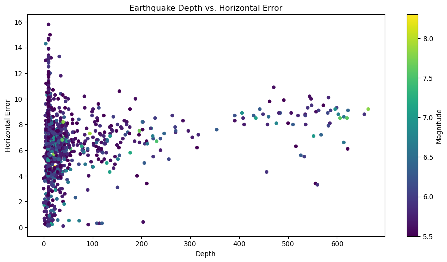
We can run a similar analysis for any number of other columns, for example, let us add Horizontal Error to the mix.
Now we see a stronger correlation between Depth and Horizontal Error, which is 0.14. This means that as the depth of an earthquake increases, the horizontal error also increases, but again not by a large factor.
When performing this type of analysis between multiple columns, it is interesting to visualy represent the data. One way to do this is by using a scatter plot, which shows the relationship between two variables. Let us see how this works.
About Scatter Plots
Scatter plots are a very useful tool to visualize the relationship between two variables. They can help identify patterns and trends in the data, and can be used to identify outliers or anomalies. There are many other types of plots that can be used to visualize data, such as line plots, bar plots, and box plots, which we will use as we progress.
This plot is showing a visual representation of the correlation between Depth and Horizontal Error, and colored by Magnitude. We can see that there is no clear relationship between the two variables, which is consistent with the correlation coefficient we calculated earlier. The c argument is used to color the points by the Magnitude column, and the cmap argument is used to specify the color map to use. Let us do a similar plot for Depth and Magnitude.
Categorical data and grouping
You will have noticed that some of the columns in the dataset are strings of text, such as Type and Source. These are called categorical data and can be used to group the data and perform analysis. Pandas offers a few methods to work with categorical data, such as groupby and pivot_table.
As an example, let us group the data by the Type column and calculate the average magnitude of each type of earthquake.
earthquakes.groupby("Type")["Magnitude"].mean()
Type
Earthquake           5.882775
Explosion            5.850000
Nuclear Explosion    5.864417
Rock Burst           6.200000
Name: Magnitude, dtype: float64
What this series shows us is the average magnitude of each type of earthquake. For example, the average magnitude of Earthquake is aproximately 5.88, and the average magnitude of Nuclear Explosion is 5.86.
We can also use the pivot_table method to group the data by multiple columns. A pivot table is a way to summarize data in a table format, and can be used to perform more complex analysis. Let us see how this works, this time by grouping the data by Type and Source.
# Pivot Type and Magnitudeearthquakes.pivot_table(values="Magnitude", index=["Type", "Source"], aggfunc="mean")
Magnitude
Type
Source
Earthquake
AK
5.858333
CI
6.037778
GCMT
5.885455
ISCGEM
6.007805
ISCGEMSUP
6.000833
NC
6.029804
NN
5.725000
OFFICIAL
8.712500
PR
5.800000
SE
5.800000
US
5.865256
UW
5.966667
Explosion
US
5.850000
Nuclear Explosion
US
5.864417
Rock Burst
US
6.200000
What this table shows us is the average magnitude of each type of earthquake, grouped by the source of the data, which is a more complex analysis than what we did before. A pivot table can be used to group data by multiple columns, and to perform more complex calculations, such as calculating the sum, mean, or median of a column. In the example above we used the aggfunc argument to specify that we want to calculate the mean of the Magnitude column. We could have used aggfunc='median' to calculate the median of the Magnitude column instead (aggfunc stands for “aggregation function”).
Using dates in our analysis
Let’s now calculate the average magnitude of the earthquakes that occurred in a given year. If you look back at the data, you will see that the Date column contains the date and time of each earthquake. We can use this column to select a given year, and then calculate the average magnitude of the earthquakes that occurred in that year.
Notice however the Date format is an object type, which means that it is a string. We need to convert it to a datetime object to be able to extract the year. We can do this with the to_datetime method.
About datetime Objects
datetime objects are a very useful data type in Python, and Pandas offers a lot of functionality to work with them. You will come across them frequently when working with time series data, and it is good to be familiar with them.
The above looks a bit special, but it is actually quite simple. We are using the to_datetime method of the Pandas library to convert dates formated as ‘month/day/year’ (commonly used in the United States, unlike ‘day/month/year’ used in Europe) to a datetime object, with errors='coerce' instructing the method to return NaT (Not a Time) for any dates that cannot be converted.
Now let us extract the year from the Date column, and add it as a new column to the dataframe.
earthquakes["Year"] = earthquakes["Date"].dt.year
The above code uses the dt accessor to access the year attribute of the Date column, and then assigns it to a new column named Year.
About Accessors
An accessor is a way to access the elements of a data structure. In this case, the dt accessor is used to access the elements of a datetime object, such as the year, month, day, etc. Accessors are useful when working with data structures that contain complex data types, such as datetime objects.
We can now check the dataframe to see if the Year column was added.
Worked! Did you notice however that the Year column is a float ? This is because the dt.year accessor returns a float type. We can convert it to an int type just to make it look nicer, but also because it makes more sense to have years as integers. We do this with the astype method.
# Fill NaN values before convertingearthquakes["Year"] = earthquakes["Year"].fillna(0).astype(int)earthquakes["Year"]
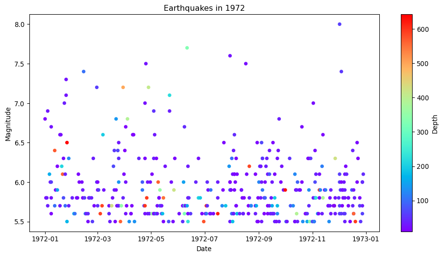
Here we are plotting the Date vs the Magnitude of the earthquakes. The plot method is used to create the plot, and the scatter plot kind is used to create a scatter plot. The c argument is used to color the points by the Depth column, and the cmap argument is used to specify the color map to use. The x and y attributes are used to set the columns for the x and y axes, and the title method is used to set the title of the plot.
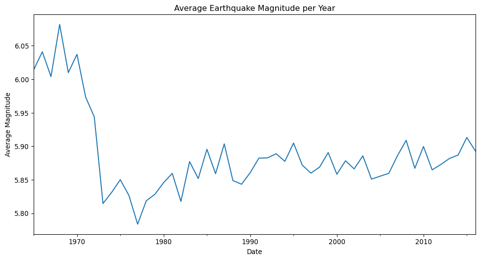
We can also use the plot method to create a line plot, which shows the relationship between two variables over time. We could for example plot the average magnitude of earthquakes over time by aggregating the data by a given time period.
You will have noticed (hopefully) that the dataset contains geographical data in the form of Latitude and Longitude. This data can be used to create maps and to perform spatial analysis. For example, we could create a map of the earthquakes in the dataset, or we could filter out the earthquakes that occurred in a given region of the planet.
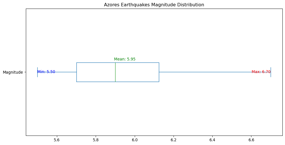
Let us take a simple example, and filter out the earthquakes that occurred around the region of the Azores islands. We will consider the region to be between 36 and 42 degrees latitude, and between -31 and -24 degrees longitude.
The above code should be self explanatory - we are filtering the dataframe by selecting the rows where the Latitude is between 36 and 42 degrees, and (the symbol & means “and”) the Longitude is between -31 and -24 degrees. Now that we have the list, let us calculate the minimum, maximum, and average magnitude of the earthquakes that occurred in this region.
There’s a neat type of plot called a boxplot that can be used to visualize the distribution of data. It shows the median, quartiles, and outliers of the data. We don’t need to go into the details of how it works for now, but it is useful to know that it exists and that it can be used to visualize the distribution of a given column.
Because we have a small dataset, we can also plot the earthquakes on a map. For this we will use the folium library which we can install with the conda command (by now you should be able to do this without further instruction).
import folium# Create a map centered around the Azoresazores_map = folium.Map(location=[38, -28], zoom_start=6.5)# Add markers for each earthquakefor _, row in azores_earthquakes.iterrows(): folium.CircleMarker( location=[row["Latitude"], row["Longitude"]], radius=row["Magnitude"], # Scale the circle size by magnitude color="blue", fill=True, fill_opacity=0.3, popup=f"Year: {int(row['Year'])} Magnitude: {row['Magnitude']}, Depth: {row['Depth']} km", ).add_to(azores_map)# Display the mapazores_map
Make this Notebook Trusted to load map: File -> Trust Notebook
The code above produces an interactive map which you can zoom in and out of, and click on the markers to see the details of each earthquake. To do so we follow a few steps:
We create a Map object using the folium library, and set the center of the map roughly to the Azores islands.
We iterate over the rows of the azores_earthquakes dataframe with a for loop, and add a marker for each earthquake to the map.
We then display the map.
Exercises
Calculate the average depth of the earthquakes that occurred in a given year.
Calculate the average number of stations that recorded an earthquake (you can uniquely identify an earthquake with the ID column) in a given year.
Calculate the average magnitude of the earthquakes that occurred in a given year, grouped by the Type column.
Explain the above code that creates a map of the earthquakes in the dataset. What does each line do?